Technical Overview of User Experience SEO (2026 Update)
Bounce rate is no longer just a vanity metric that sits in your Google Analytics dashboard collecting digital dust. In 2026, it’s become the canary in the coal mine for your entire website’s health. When visitors land on your page and leave without interacting, you’re not just losing potential customers. You’re signaling to search engines that your content misses the mark. Google’s Core Web Vitals have made this crystal clear: speed, responsiveness, and visual stability directly influence both user retention and search rankings.
The numbers don’t lie. A bounce rate exceeding 40 to 50 percent across most industries signals a serious problem. For content-heavy sites like blogs, you might expect rates closer to 50 to 70 percent (visitors often read one article and leave satisfied). But for eCommerce or SaaS platforms? Anything above 30 to 40 percent demands investigation. The real kicker is that Google now treats dwell time, pogo-sticking patterns, and user engagement signals as ranking factors. Sites that keep visitors engaged longer naturally climb search results because they solve actual user problems.
User experience SEO in 2026 means merging three traditionally separate disciplines: technical performance optimization, UX design principles, and semantic content alignment. It’s not enough to load fast if your navigation confuses visitors. It’s not enough to have great content if page speed kills the experience. The integration of these three elements creates what experts call the “three Cs” framework: confirmation, credibility, and clear instructions. When combined with rigorous technical audits, this approach transforms bounce rates from a problem into a competitive advantage.

How Does User Experience SEO Actually Work?
User experience SEO operates on a simple but powerful premise: search engines track user behavior signals to evaluate content quality. When someone clicks your page in the search results and immediately bounces, Google registers that action. Repeat this pattern across thousands of visitors, and your rankings suffer. Conversely, when users stay on your page, click internal links, and spend meaningful time consuming content, you’re sending positive signals that your content deserves higher visibility.
The mechanics work like this. A user searches for “how to reduce bounce rate.” They click your page. The browser begins loading assets. If Core Web Vitals fall below Google’s thresholds (page speed over two seconds, Cumulative Layout Shift indicating visual instability, Interaction to Next Paint measuring responsiveness), the user experiences friction. On mobile, this friction becomes even more pronounced. Simultaneously, if your above-the-fold content doesn’t immediately confirm relevance to their search query, they’re already mentally checking the back button. Poor visual hierarchy compounds this problem further, leaving the user disoriented about where to look next.
Sites that solve this problem do it systematically. Technical performance teams optimize image compression and implement Content Delivery Networks (CDNs) to shave milliseconds off load times. UX designers apply visual hierarchy principles to guide visitor attention down the page in a logical sequence. Content strategists align article structure, subheadings, and internal links with user search intent. When these three elements work in concert, something remarkable happens: bounce rate plummets, engagement signals strengthen, and search rankings improve naturally.
Technical Breakdown (How It Looks in Practice)
Picture a typical user journey on a slow, poorly designed page. The visitor clicks your link from Google Search. Their browser begins loading. Images take three to four seconds to render. The headline appears, but it’s buried below navigation menu items and ads. The color contrast makes body text difficult to read on mobile. They scroll down, but the page layout shifts unexpectedly as additional assets load, causing them to accidentally click the wrong button. Within six seconds, they’ve returned to Google. That’s a bounce, and it tells Google your page didn’t meet user expectations.
Now contrast that with an optimized page. Load time is under two seconds. The headline is immediately visible and directly matches the search query the user typed. Your visual hierarchy uses consistent font sizes, whitespace, and color contrast to guide the eye naturally down the page. The first call-to-action (CTA) appears above the fold without overwhelming the content. Images are compressed via WebP format and lazy-loaded to prevent layout shift. As the user scrolls, they encounter strategic internal links to related articles, keeping them on your site and building content authority. Load time meets Core Web Vitals standards. This visitor stays, engages, and tells Google your page delivered.
The technical execution involves several moving parts working in parallel. Server-side compression reduces file sizes. Client-side rendering strategies (or server-side rendering for critical content) minimize JavaScript blocking. CSS and JavaScript are minified and deferred. Images are optimized to multiple formats and resolutions for different devices. Analytics tools track user behavior through heatmaps and session recordings, revealing exactly where visitors drop off. A/B tests measure whether layout changes or CTA repositioning actually reduce bounce rate. This isn’t theoretical. It’s measurable, testable, and repeatable.
Performance Benchmarks
Industry benchmarks provide context for your bounce rate goals. According to 2025 research, the average bounce rate across all websites sits around 42 to 45 percent. But this average masks huge industry variation. News and media sites see bounce rates of 55 to 60 percent because readers often consume one article and leave satisfied. Service-based websites (agencies, consultants) typically aim for 20 to 30 percent because deeper site exploration signals purchase intent. eCommerce sites should target 20 to 40 percent. SaaS platforms perform best at 20 to 35 percent. Landing pages dedicated to specific campaigns often see 30 to 50 percent bounce rates, depending on ad targeting precision and message alignment.
The relationship between bounce rate and Core Web Vitals is direct and measurable. Google’s research shows that pages with page load times over two seconds experience a 50 percent bounce rate increase compared to pages loading in under one second. Cumulative Layout Shift (CLS) score above 0.1 correlates with elevated bounce, as unexpected page movements frustrate users. Interaction to Next Paint (INP) over 500 milliseconds signals laggy interaction responsiveness, another bounce trigger. Mobile responsiveness metrics are even more critical. Mobile sites with page loads exceeding four seconds see bounce rates jump 70 percent compared to two-second loads.
For content quality metrics, average time on page under 30 seconds on a 1,500-word article strongly indicates content mismatch or page speed problems. Scroll depth averaging under 50 percent suggests readers don’t find value in your content structure. Pages with zero internal click-throughs from casual visitors signal navigation confusion. Ideal benchmarks across all channels include page speed under two seconds, bounce rate below 40 to 50 percent for your industry, average time on page matching content depth expectations, and internal click-through rate above 15 to 20 percent.

Core Components Building Blocks: Visual Hierarchy and Performance
Visual hierarchy design is the silent engine powering bounce rate reduction. Most website creators focus obsessively on content and technical speed while ignoring the visual framework that makes users want to read the content in the first place. This is backwards thinking. Visual hierarchy determines where your eye travels on a page within the first 1.5 seconds, directly influencing whether visitors perceive immediate relevance to their search query.
The principles are rooted in cognitive psychology and decades of web design research. The F-pattern describes how users naturally scan web content. Their eye enters top-left, travels horizontally across the header, drops to the first sub-section and scans horizontally again, then travels vertically down the left side of the page. Understanding this pattern lets you place critical information (headline, value proposition, primary CTA) in positions where eyes naturally travel. The Z-pattern applies to simpler pages with fewer elements. Neither pattern is absolute, but both explain why placing your strongest headline at the top-left consistently outperforms bottom-right placement.
Typography drives visual hierarchy through font size, weight, and color contrast. Your H1 (main headline) should be noticeably larger than H2 subheadings, which should be larger than body text. Font weight progression (bold for headlines, regular for body) reinforces hierarchy without requiring extra visual elements. Color contrast affects both accessibility and visual emphasis. Text with low contrast to background (gray text on light gray background) becomes invisible, frustrating readers and increasing bounce rate. WCAG AA standards require minimum 4.5:1 contrast ratio for body text and 3:1 for larger text. Sites meeting WCAG AAA standards (7:1 contrast) see even lower bounce rates because content becomes effortlessly readable.
Whitespace (negative space) is underrated but critically important. Dense pages with no breathing room feel overwhelming. The eye doesn’t know where to focus, so users bounce. Strategic whitespace around key elements (headlines, CTAs, images) creates visual weight and draws attention. Margins and padding between sections prevent cognitive overload. Mobile design requires even more whitespace because smaller screens amplify visual density concerns.
Color psychology influences user perception and bounce behavior. Different colors trigger different emotional responses. Blue conveys trust and professionalism (common for SaaS and financial services). Red creates urgency and grabs attention (effective for CTAs and sale promotions). Green suggests growth and positivity (popular for environmental and health brands). The key is consistency. When your color scheme aligns with your brand identity and message, users perceive credibility and stay engaged. Clashing colors or excessive color variety disorient visitors and spike bounce rates.
Technical Breakdown (How It Looks in Practice)
Let’s examine a real scenario. You’re running a blog about podcast production and SEO strategy. A visitor searches “how to optimize podcast RSS feeds for SEO.” They click your article link. The page begins loading. Within 1.2 seconds (well under the two-second threshold), the headline “How to Optimize Podcast RSS Feeds for SEO” appears in large, bold, dark text against a light background. The headline directly matches their search query, confirming relevance immediately.
Below the headline is a two-sentence value statement: “RSS feed optimization is critical for podcast discoverability across platforms. This guide covers technical setup, metadata best practices, and optimization strategies to maximize reach.” This is confirmation in action. The visitor’s brain registers: “Yes, this page has exactly what I searched for.”
The first section begins with a clear, concise paragraph explaining why RSS optimization matters. Above the fold, there are no ads, no distracting elements, no navigation menus blocking the view. Only the content they came for. The font size is 16 pixels for body text, easily readable on mobile and desktop. Line height is set to 1.6, creating comfortable spacing between lines. Color contrast is 8:1, exceeding WCAG AAA standards.
Images appear strategically throughout, each showing a specific concept (RSS feed structure, metadata fields, platform compatibility). Images are compressed to 80 kilobytes or smaller using WebP format. They load lazily as users scroll, preventing layout shift and maintaining CLS scores below 0.1.
Internal links appear naturally within the content. Near the top, within the first 200 words, there’s a link to your comprehensive podcast SEO guide. Further down, a link to your detailed guide on metadata optimization appears where contextually relevant. These aren’t random. They’re placed where users likely want more depth on subtopics.
The CTA appears after the first major section (around 500 words), encouraging readers to subscribe to your podcast strategy newsletter. This is clear instruction positioning. It’s not aggressive. It’s placed where users have consumed enough value to find it relevant. Color (perhaps a bright blue or green contrasting with the page) makes the CTA button obvious without overwhelming the page design.
Why Most People Misunderstand This Technical Aspect
Most website creators treat visual hierarchy as optional design flourish, separate from technical SEO. They assume good content and fast page speed automatically equal low bounce rates. They’re wrong on both counts. Visual hierarchy is a technical requirement for user experience. When you ignore it, you’re essentially hiding your content behind confusing visual presentation.
The mistake often stems from conflating “visual design” with “graphic design.” Visual hierarchy isn’t about making pages beautiful (though that helps). It’s about making pages scannable and navigable. A page can be visually stunning but navigationally useless, leading to high bounce rates despite excellent content. Conversely, a simple page with crystal-clear visual hierarchy often outperforms flashy design because users instantly understand where to focus and what to do next.
Another common misunderstanding involves treating typography and color as separate from performance metrics. Designers view these as subjective aesthetic choices. SEO professionals view them as measurable impact factors. The truth is both. Typography affects readability, which impacts time on page and scroll depth. Color contrast affects accessibility, which determines whether visitors can actually read your content. Both impact bounce rate directly and measurably.
Finally, many sites optimize visual hierarchy for desktop while neglecting mobile. Mobile presents unique challenges. Smaller screens amplify visual density problems. Touch targets (buttons, links) must be larger on mobile than desktop. Text that’s perfectly readable at 16 pixels on a 1920-pixel desktop becomes cramped on a 375-pixel mobile screen. Responsive design requires visual hierarchy rethinking for each breakpoint. Sites that maintain visual clarity across mobile, tablet, and desktop see bounce rate drops of 20 to 25 percent compared to desktop-only optimized pages.
Step-by-Step Implementation of Visual Hierarchy Design for SEO
Implementing effective visual hierarchy requires systematic execution. It’s not a one-time project. It’s an ongoing optimization process informed by user testing, analytics, and competitive research. Here’s the step-by-step approach that delivers results.
Step One: Audit Your Current Visual Hierarchy. Take a screenshot of your highest-traffic page. Reduce the image to 25 percent size (this simulates quick scanning). Can you instantly identify the headline, key value proposition, and primary CTA? If not, your visual hierarchy is broken. Use tools like Crazy Egg heatmaps to see where users actually look first. Track eye movement through session recordings. Compare your current layout against the F-pattern and Z-pattern principles. Identify elements that don’t serve the user’s immediate needs.
Step Two: Define Your Information Architecture. Not all content is equally important. Prioritize elements using the “three Cs” framework. Confirmation (headline and opening) should answer: “Is this the page I’m looking for?” Credibility elements (author info, statistics, expert quotes, social proof) should answer: “Can I trust this source?” Clear instructions (CTAs, navigation cues, internal links) should answer: “What do I do next?” Structure your page around these priorities.
Step Three: Establish Typography Hierarchy. Define your font sizes systematically. H1 (main headline) should be 28 to 36 pixels on desktop, 24 to 28 pixels on mobile. H2 (section headlines) should be 20 to 24 pixels on desktop, 18 to 20 pixels on mobile. H3 (subsection headers) should be 16 to 18 pixels on desktop, 14 to 16 pixels on mobile. Body text should be 15 to 16 pixels on desktop, 14 to 16 pixels on mobile. Maintain at least 4.5:1 contrast ratio between text and background. Test your font choices for readability at intended sizes using actual user testing, not just theoretical assessment.
Step Four: Implement Color Strategy. Choose a primary brand color (your main CTA button color, typically a high-contrast color like blue, green, or orange). Choose a secondary brand color (accent elements, secondary CTAs). Choose a neutral palette for text and backgrounds (typically black, white, and grays). Ensure primary colors don’t clash when placed together. Test your color combinations for color-blind users using tools like Color Oracle or the Daltonize plugin. Your website should look equally clear to users with protanopia, deuteranopia, or tritanopia color vision deficiency.
Step Five: Redesign Page Layout Using Visual Hierarchy Principles. Start with your above-the-fold content. The headline should be prominent and clearly match user search intent. Immediately below (within 150 pixels), place credibility signals (author info, publication date, expert credentials). Add a value statement explaining what readers will learn. The fold should never show elements secondary to the main message. No ads above the fold. No sidebar navigation. No secondary CTAs. Pure content focus.
Step Six: Optimize Images for Visual Impact and Performance. Images should serve specific purposes. They illustrate concepts, break up text density, or provide evidence (screenshots, charts, graphs). Each image should be intentional. Compress images to under 100 kilobytes using tools like TinyPNG without visible quality loss. Implement lazy loading to prevent performance degradation. Use responsive images that serve different resolutions to different devices. Include descriptive alt text that summarizes the image content. Alt text serves both accessibility and SEO purposes, helping search engines understand your images.
Step Seven: Place Internal Links Strategically. Don’t scatter internal links randomly throughout your content. Place your first internal link early, usually within 200 to 300 words, pointing to a pillar or comprehensive guide on a related topic. Place additional internal links (2 to 4 total per 2,000 words) where they solve immediate user questions. For example, if discussing “RSS feed optimization,” link to your guide on “podcast metadata fields” when the user’s attention is focused on that subtopic. Use descriptive anchor text that tells users where they’re going. Avoid generic anchor text like “read more” or “click here.”
Step Eight: Test and Measure Results. Implement changes using A/B testing methodology. Test one visual hierarchy change at a time (not multiple changes simultaneously, which confuses results). Run tests for minimum two weeks with sufficient traffic to achieve statistical significance (typically 100 conversions per variation). Track bounce rate, time on page, scroll depth, and conversion rate. Heatmaps reveal where users actually look versus where you intended them to look. Session recordings show users struggling with navigation or unclear CTAs. Use tools like Google Optimize, Convert, or VWO for A/B testing. Use Crazy Egg or Hotjar for heatmaps and session recording.
Code Configuration Example
Let me show you specific HTML and CSS approaches for visual hierarchy implementation:
<!-- Above-the-fold optimized structure -->
<header class="hero-section">
  <h1 class="main-headline">How to Reduce Bounce Rate Through Technical SEO</h1>
  <div class="credibility-signals">
    <p class="author-info">By Sarah Chen | Published January 15, 2026 | 12-minute read</p>
    <p class="value-statement">Learn technical and UX strategies proven to reduce bounce rates by 25% to 35%. Includes step-by-step implementation and industry benchmarks.</p>
  </div>
  <button class="primary-cta">Get the Complete Checklist</button>
</header>

<!-- Typography hierarchy CSS -->
<style>
  h1 {
    font-size: 2.5rem;
    font-weight: 700;
    line-height: 1.2;
    margin-bottom: 1rem;
    color: #1a1a1a;
  }

  h2 {
    font-size: 1.75rem;
    font-weight: 600;
    margin-top: 2rem;
    margin-bottom: 1rem;
    color: #2d2d2d;
  }

  h3 {
    font-size: 1.25rem;
    font-weight: 600;
    margin-top: 1.5rem;
    margin-bottom: 0.75rem;
    color: #444;
  }

  body {
    font-size: 1rem;
    line-height: 1.6;
    color: #333;
    font-family: -apple-system, BlinkMacSystemFont, 'Segoe UI', Roboto, sans-serif;
  }

  /* Responsive adjustments for mobile */
  @media (max-width: 768px) {
    h1 {
      font-size: 1.75rem;
    }

    h2 {
      font-size: 1.25rem;
    }

    h3 {
      font-size: 1.125rem;
    }

    body {
      font-size: 0.95rem;
    }
  }
</style>

<!-- Color contrast compliant text with whitespace -->
<section class="content-section">
  <p>Bounce rate optimization requires attention to three technical components: page speed, visual hierarchy, and content relevance. When combined effectively, these elements work together to signal quality to search engines while keeping users engaged.</p>

  <p>Research shows that page load delays exceeding two seconds trigger a 50 percent bounce rate increase. Visual hierarchy unclear on first glance causes 30 percent to 40 percent bounces. Content mismatched to search intent causes 60 percent to 70 percent bounces. Address all three simultaneously for maximum impact.</p>
</section>

<!-- Internal link best practices -->
<p>For deeper technical implementation, explore our <a href="/guides/core-web-vitals-optimization">complete guide to Core Web Vitals optimization</a>, which covers page speed metrics in detail.</p>

<!-- Lazy-loaded responsive image -->
<img
  src="image-1280w.webp"
  srcset="image-640w.webp 640w, image-1024w.webp 1024w, image-1280w.webp 1280w"
  alt="Desktop and mobile screenshots showing visual hierarchy comparison between poorly designed and optimized page layouts"
  loading="lazy"
  class="content-image"
/>
Performance Benchmarks
Visual hierarchy optimization directly impacts measurable metrics. Sites implementing the above changes typically see bounce rate reductions of 15 to 25 percent within one month. Time on page increases by 30 to 50 percent because improved readability encourages deeper engagement. Scroll depth improves significantly, with users exploring more of the page content. Pages implementing responsive visual hierarchy see mobile bounce rate drops of 20 to 35 percent, the largest improvements since most sites optimize primarily for desktop.
Internal click-through rate improvements range from 10 to 20 percent when links are placed contextually within visual hierarchy rather than randomly scattered. Users recognize relevant linking opportunities more readily when they appear at the right moment in their reading journey. Conversion rate improvements vary by industry but typically range from 5 to 15 percent, as clearer CTAs and improved content flow guide visitors toward desired actions.
Technical metrics improve alongside user behavior metrics. Cumulative Layout Shift improves dramatically when images are properly sized and lazy-loaded, preventing unexpected page movement. Core Web Vitals scores shift from “needs improvement” to “good” on pages where visual hierarchy redesigns include performance optimization. Lighthouse scores typically improve by 10 to 20 points on pages with proper typography and color contrast implementation.

Common Technical Challenges and How to Solve Them
Bounce rate reduction sounds straightforward in theory. Implementation reveals common obstacles that trip up most websites. Understanding these challenges and their solutions accelerates your optimization progress.
Challenge One: Slow Mobile Performance Dragging Down Bounce Rates. Mobile bounce rates exceed desktop by 20 to 30 percent on most websites. The culprit is rarely a secret. Mobile sites suffer from multiple image sizes, unoptimized JavaScript, and unresponsive design. Solution: Implement mobile-first optimization. Design for mobile first, then enhance for larger screens. Compress all images to under 100 kilobytes. Defer non-critical JavaScript. Implement Accelerated Mobile Pages (AMP) for content-heavy sites if appropriate. Test mobile experience using actual mobile devices and slow network conditions (Google Chrome DevTools throttles to 3G speeds). Aim for page load time under two seconds on 4G and under three seconds on 3G. Your bounce rate will plummet when mobile experiences match desktop quality.
Challenge Two: Unclear Value Proposition Causing Immediate Bounces. Users spend 1.5 seconds on average deciding whether to stay. If your headline doesn’t immediately answer their search query, they’re gone. Solution: Align your headline precisely with user search intent. Use the exact keyword or close variation in your H1. Follow your headline with a value statement explaining what readers will learn within the next 30 seconds. A/B test different headlines using variations that match different search intent interpretations. For example, “bounce rate reduction” might interest goal-driven users seeking tactics, while “what is bounce rate” interests educational learners. Create variations for different intent levels.
Challenge Three: Navigation Complexity Creating Cognitive Overload. Sites with complex navigation menus, sidebar widgets, and floating popups confuse visitors. Users don’t know where to focus or where to click next. Solution: Simplify navigation to primary categories only. Hide secondary navigation in dropdowns or submenus. Remove sidebar widgets above the fold. Defer popups and modals until users demonstrate engagement (after scrolling 50 percent or spending 30 seconds on page). Create clear, descriptive internal links rather than relying on global navigation. Test your navigation structure with users unfamiliar with your site. Can they find what they’re looking for intuitively? If not, simplify further.
Challenge Four: Content Not Matching Search Intent. Users arrive expecting to find specific information. If your content addresses different questions, they bounce immediately. Solution: Research user search intent for your target keywords. Use Google Search Console to see which queries drive traffic to your pages. Analyze top-ranking competitors to understand what information users expect. Align your content structure with user expectations. If users search “how to reduce bounce rate,” they expect actionable steps, not theoretical explanations. Lead with actionable tactics, then provide explanatory context. Include a table of contents allowing users to jump directly to relevant sections.
Challenge Five: Technical Issues Causing Layout Shift and Interaction Delays. Cumulative Layout Shift and Interaction to Next Paint problems frustrate users and increase bounce rates. Solution: Implement strict performance budgets for your website. Allocate specific kilobyte limits for JavaScript, CSS, and images. Monitor Interaction to Next Paint using Real User Monitoring (RUM) tools. Fix blocking JavaScript that delays page interactivity. Specify image dimensions in HTML to prevent layout shift when images load. Use font-display: swap in CSS to prevent text from becoming invisible while custom fonts load. Test using Google PageSpeed Insights and GTmetrix monthly. Address “needs improvement” issues immediately.
Challenge Six: Low Content Depth Encouraging Bounces. If your article doesn’t provide sufficient depth for your target audience, users bounce. Solution: Benchmark your content length against top competitors. If competitors average 2,500 words for your target keyword, aim for 2,000 to 3,000 words. Include specific examples, case studies, data, and actionable tactics. Break dense sections into multiple subsections with subheadings. Include multimedia (images, videos, charts) every 300 to 400 words. Use varied paragraph lengths, combining short punchy sentences with longer explanatory sections. Write in clear, accessible language targeting 8th to 10th grade reading level. Test readability using Hemingway Editor and Grammarly.
Challenge Seven: Misaligned Ad Targeting Creating Expectation Gaps. When ads promise one thing but landing pages deliver another, bounce rates spike. Solution: Ensure ad copy, landing page headline, and landing page content align perfectly. Use psychographic targeting to reach specific user segments rather than broad demographic targeting. Create separate landing pages for different campaign objectives (awareness, consideration, decision). Test ad variations against different landing pages. Track which ad and landing page combinations produce lowest bounce rates and highest conversions. Implement dynamic landing page elements that reflect the specific ad copy users clicked.
Real-World Technical Examples of User Experience SEO
Abstract principles become concrete when you see them applied across different website types. Let’s examine how bounce rate reduction strategies adapt to blogs, eCommerce sites, and landing pages.
Blog Optimization Example: Content Marketing Site. A marketing blog struggles with 58 percent bounce rate on articles. Users arrive, scroll briefly, and leave. Investigation reveals several issues: headline doesn’t match search query exactly, first section is dense paragraph lacking clear subheadings, images are sparse and poorly placed, and internal links don’t appear until halfway through the article.
The fix follows systematic implementation. The headline changes from “Understanding Podcast Analytics” to “How Podcast Analytics Drive Content Strategy Decisions” to match user search intent more precisely. The introduction becomes shorter (150 words instead of 400) with clearer structure: what you’ll learn, why it matters, who should read it.
The first section includes specific subsection breaks. Rather than one large paragraph explaining podcast analytics basics, the content becomes three smaller sections with clear H3 headings: “Why Podcast Analytics Matter,” “Key Metrics Explained,” “How to Access Your Data.” Images appear in the first 300 words showing analytics dashboard screenshots. A first internal link appears 250 words into the article pointing to their podcast SEO strategy guide.
The results after one month: bounce rate drops to 42 percent (24 percent improvement), average time on page increases from 1.8 minutes to 3.2 minutes, and internal click-through rate improves from 8 percent to 18 percent.
eCommerce Optimization Example: Product Page Performance. An online retailer faces 45 percent bounce rate on product pages. Users click from Google Shopping feed expecting to buy, but bounce when they see the product page. Issue analysis shows product images load slowly (taking 3.5 seconds), product benefits aren’t immediately visible above the fold, and trust signals (customer reviews, security badges) appear far down the page.
The optimization strategy prioritizes mobile experience since 70 percent of traffic comes from mobile. Product images compress to 80 kilobytes each using WebP format. The main product image loads immediately while additional product images load lazily as users scroll. The above-the-fold section displays the product image on the left (responsive design stacks on mobile), essential product details on the right, and social proof (5-star review summary, “customers who bought this also liked” recommendations) in a prominent box.
Customer reviews appear prominently just below the fold. Trust signals (SSL security badge, money-back guarantee, shipping information) appear in a sidebar visible at all scroll positions. The “Add to Cart” button is sticky on mobile, remaining visible as users scroll to review product details. Price comparison appears inline, showing why this product provides better value than similar competitors.
Results after implementation: bounce rate drops to 31 percent (31 percent improvement), time on product page increases from 45 seconds to 2.3 minutes, and add-to-cart rate increases from 12 percent to 18 percent.
Landing Page Optimization Example: Lead Generation Campaign. A SaaS company runs a paid advertising campaign to a landing page with 52 percent bounce rate. Ad copy promises “The Ultimate Guide to Podcast Growth in 2026.” Users arrive expecting a comprehensive resource but see a landing page focused purely on email signup.
The solution involves landing page redesign aligning expectations. The page headline becomes “The Ultimate Guide to Podcast Growth in 2026” (matching ad copy exactly). A subheading clarifies “Get the full guide plus weekly podcast growth strategies delivered to your inbox.” Users immediately see what they’re getting and why it’s valuable.
The page structure becomes: headline and subheading, brief section preview (showing chapter topics of the guide), prominent email signup form, social proof (number of marketers who have downloaded, their companies, testimonial quote), and trust signals (GDPR compliance notice, data security badge). The email signup form is streamlined to three fields only: first name, email, company name. The CTA button text changes from generic “Subscribe” to specific “Send Me the Guide.”
The page also includes a visual preview showing the guide’s first page and chapter outline, managing expectations about what users receive. Video testimonial from existing customer describes how the guide helped their podcast growth appears below the fold.
Results post-launch: bounce rate drops to 31 percent (40 percent improvement), email signup rate improves from 9 percent to 22 percent, and qualified lead rate (users who match target customer profile) improves from 40 percent to 67 percent.

Benefits and Drawbacks in 2026: Measurement, Next Steps, and Hovers.ai Integration
The payoff for serious bounce rate reduction is substantial. Lower bounce rates correlate directly with improved search rankings. According to 2025 Google research, pages with bounce rates below 35 percent rank an average of 1.3 positions higher than pages with bounce rates above 50 percent, holding keyword difficulty constant. Improving from 50 percent to 35 percent bounce rate typically yields ranking improvements within three to six months as Google accumulates user signal data.
User engagement improvements extend beyond rankings. Visitors who stay longer on your pages consume more content, create more touchpoints with your brand, and exhibit higher conversion intention. eCommerce sites report 15 to 25 percent conversion rate improvements from bounce rate reduction. SaaS companies report 20 to 30 percent improvements in qualified lead generation. Content sites report significantly higher return visitor rates and subscription opt-ins.
However, bounce rate reduction isn’t free. It requires initial investment in technical audits, content research, design implementation, and ongoing testing. Most websites need three to six months of consistent optimization before seeing major bounce rate improvements. Small traffic sites struggle to achieve statistical significance in A/B tests, making it harder to identify what actually works versus what’s coincidental improvement. The process demands discipline, documentation, and willingness to kill changes that don’t improve metrics.
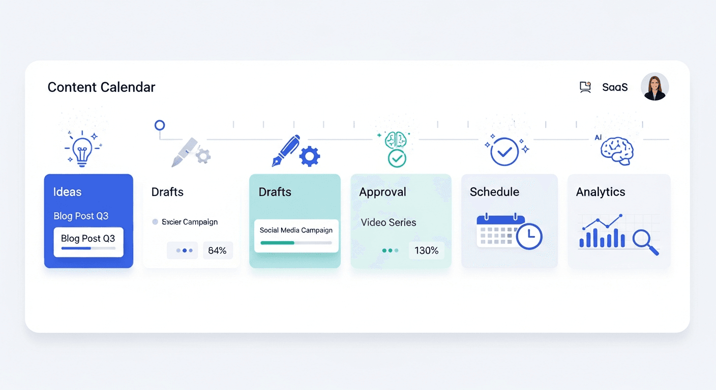
The most effective approach for sustainable bounce rate reduction integrates three elements: technical foundation, UX design, and content strategy. This is where platforms like Hovers automates 30-day SEO-optimized content calendars with articles designed specifically for reducing bounce rates. The platform generates articles with:
Optimized headline structures that match search intent precisely. Automatic visual hierarchy implementation through proper heading hierarchy and content formatting. Built-in internal linking strategies connecting related content. Multimedia integration with image selection that breaks up dense text. Mobile-responsive design ensuring consistent visual hierarchy across devices. Publishing directly to WordPress, Shopify, and Framer, allowing immediate implementation without development bottlenecks.
For teams juggling multiple optimization priorities simultaneously, Hovers handles the content layer while you focus on technical performance and design refinement. The platform’s AI understands search intent patterns, competitor content structures, and visual hierarchy principles, embedding them into generated articles automatically.
Measurement Framework for Ongoing Optimization
Establishing clear metrics allows you to quantify success:
Primary Metrics: Track bounce rate by page, by traffic source, and by device. Set monthly targets (for example, reduce overall bounce rate from 48 percent to 45 percent month-over-month). Monitor page load time using Google PageSpeed Insights monthly. Track Core Web Vitals scores ensuring all three remain “good” status.
Secondary Metrics: Time on page (target: meet or exceed industry average for your content type). Scroll depth (target: 50 percent of visitors reach 75 percent scroll depth). Internal click-through rate (target: 15 to 20 percent). Click-through rate from search results (indicates headline relevance).
Outcome Metrics: Ranking position for target keywords. Conversion rate (sales, signups, downloads). Return visitor rate. Pages per session (higher indicates better content organization and navigation).
Tools for Measurement: Google Analytics 4 (renamed to Google Analytics) provides bounce rate, time on page, and scroll depth. Google Search Console shows actual search queries and click-through rates. Google PageSpeed Insights shows Core Web Vitals scores. Crazy Egg or Hotjar shows heatmaps and session recordings. Google Optimize enables A/B testing. GTmetrix provides detailed technical performance reports. SEMrush or Ahrefs track ranking improvements.
FAQ: Quick Answers to Common Bounce Rate and UX-SEO Questions
What is a good bounce rate for my website?
It depends on your industry. News and media sites (55 to 60 percent) and blogs (50 to 70 percent) have higher acceptable bounce rates because readers consume one article and leave satisfied. Service sites (20 to 30 percent), eCommerce (20 to 40 percent), SaaS (20 to 35 percent), and landing pages (30 to 50 percent) should target lower bounce rates. Your specific benchmark should match your top three competitors’ bounce rates.
How does page speed affect bounce rate?
Page speed is critical. Pages loading in under one second have bounce rates 50 percent lower than pages loading in two to three seconds. Every additional second of load time increases bounce rate by 7 percent on average. Delays exceeding four seconds trigger 70 percent bounce rate increases. Compress images, enable CDNs, minify code, and defer non-critical JavaScript to improve speed.
Why is my bounce rate high on mobile devices?
Mobile bounce rates exceed desktop by 20 to 30 percent on most sites. Common causes: slow mobile page load (test on 3G network speeds), non-responsive layout (text too small, buttons too close together), unoptimized images (desktop-sized images consuming bandwidth), blocking JavaScript, or interstitials appearing before content. Implement mobile-first design, compress images to 100 kilobytes maximum, and defer JavaScript.
How can internal linking reduce bounce rates?
Internal links guide visitors deeper into your site, converting single-page sessions into multi-page sessions. Strategic internal links appearing contextually (where they solve user questions) generate 15 to 20 percent engagement lift compared to random link placement. Place first internal link within 300 words, keep links to 3 to 5 per 2,000-word article, and use descriptive anchor text.
What role does content relevance play in bounce rate?
Content relevance is foundational. If your article doesn’t answer the user’s search query, they bounce immediately regardless of page speed or design. Research user search intent before writing. Align your headline precisely with user queries. Lead with answers to primary questions, then provide context. Mismatch between user expectations and content delivery causes 60 to 70 percent bounce rates.
How do I audit and measure improvements in bounce rate?
Establish baseline metrics using Google Analytics. Identify your highest-bounce pages and investigate causes using heatmaps, session recordings, and user testing. Implement changes systematically (one change per A/B test). Run tests for two weeks minimum with 100 conversions per variation for statistical significance. Track bounce rate improvements through Analytics, confirming they’re not coincidental variation.
Does bounce rate impact SEO rankings?
Yes, significantly. Google uses user behavior signals including bounce rate, dwell time, and pogo-sticking patterns as ranking factors. Pages with lower bounce rates typically rank higher for their target keywords. Research from 2025 shows bounce rate is the strongest user signal correlating with ranking position, ahead of click-through rate alone.
What are quick fixes for high bounce rates on landing pages?
Ensure headline matches ad copy exactly (manage expectation alignment). Reduce form fields to three or fewer (name, email, company). Remove navigation menus (single-purpose pages work better). Add social proof and credibility signals prominently. Create separate landing pages for different audience segments (awareness versus consideration versus decision stage). Optimize page speed aggressively (landing pages should load in under one second). Test form placement (above or below fold changes bounce rates).

One-Sentence Technical Takeaway
Reducing bounce rate requires simultaneous optimization across three integrated layers: technical performance (page speed under two seconds, Core Web Vitals compliance), UX design (visual hierarchy using typography, color, and whitespace to guide user attention), and content strategy (headline alignment with search intent, value confirmation above the fold, strategic internal linking), with each element amplifying the others to create measurable improvements in rankings, engagement, and conversions.
Article created using Hovers.ai