How to Build a Performance Dashboard That Drives Decision-Making
Building a performance dashboard isn’t just about collecting metrics and throwing them onto a screen. It’s about creating a strategic tool that transforms raw data into actionable insights that actually move the needle on business outcomes. Whether you’re optimizing marketing performance, tracking content metrics, or monitoring operational KPIs, the dashboard you build needs to tell a story, answer critical questions, and empower your team to make smarter decisions faster.
The stakes are real. According to recent research, companies that leverage data-driven decision-making see 5-6% higher productivity than their competitors. Yet most organizations struggle with dashboard creation because they either overwhelm users with too much information or fail to surface what actually matters. This guide cuts through the noise and walks you through building a performance dashboard that drives results, step by step.
By the end of this article, you’ll understand how to define your dashboard strategy, design an intuitive layout that respects cognitive load, integrate the right analytics tools like segment analytics, and implement AI-powered features that keep you ahead of 2026 trends. Let’s build something that actually works.
What You’ll Need Before You Start
Before you dive into dashboard creation, you need to gather the right resources, tools, and mindset. Success depends on preparation.
Why This Step Is Important
Jumping into dashboard design without preparation is like building a house without a foundation. You’ll waste time, frustrate stakeholders, and end up redesigning the dashboard multiple times. Smart preparation eliminates rework and ensures your dashboard aligns with business objectives from day one.
Exact Settings and Configuration I Recommend
Here’s what you should have in place before starting:
1. Choose Your Analytics Platform
You have three main categories to consider. Business intelligence platforms like Tableau and Yellowfin offer enterprise-grade features but require technical expertise. Self-service tools like Google Data Studio and Looker provide faster setup with lower learning curves. Specialized platforms like Segment Analytics excel at real-time data segmentation and customer analytics integration.
For most teams, I recommend starting with a platform that offers both ease of use and integration depth. Segment Analytics, for example, shines when you need to combine data from multiple sources and create audience segments in real time. If you’re focused on content performance and SEO metrics, Google Data Studio integrates seamlessly with Google Analytics 4 and Search Console.
2. Gather Your Data Sources
Create a master list of every data source you’ll need: Google Analytics, CRM systems, marketing automation platforms, revenue data, content management systems, and any custom databases. Document API access, authentication requirements, and data refresh frequencies. This prevents mid-project delays when you discover a data source doesn’t connect as expected.
3. Assemble Your Team
You need three roles: a stakeholder who defines business needs and success metrics, a data expert who knows your sources and can validate accuracy, and a designer or product manager who understands user experience principles. Even in small teams, these responsibilities should be explicitly assigned.
4. Define Success Metrics Upfront
Before touching a single dashboard component, document how you’ll measure success. Will adoption be measured by weekly active users? Decision speed? Stakeholder satisfaction scores? Having defined success criteria ensures your dashboard serves its intended purpose.
Pro Tip Most People Miss
Most teams jump straight to tool selection before clarifying their needs. Instead, spend 2-3 hours answering these questions first: What specific decisions does this dashboard need to enable? Who makes those decisions? What information do they currently lack? Once you answer these questions, tool selection becomes obvious.

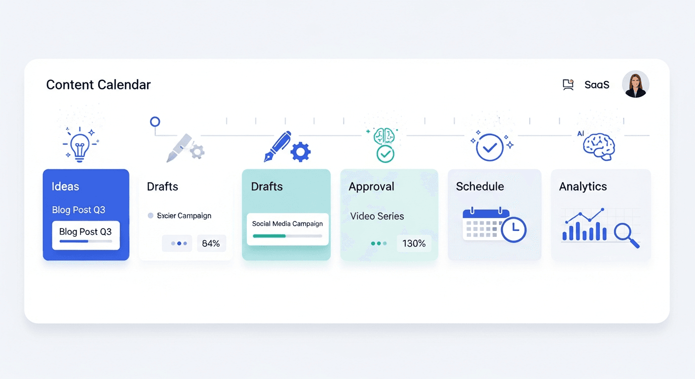
Step 1: Define Your Dashboard Goals and Audience Personas
This is where everything starts. A vague dashboard is a useless dashboard. Precision in goal-setting directly correlates with dashboard adoption and impact.
Understanding Your Audience Personas
Different users need fundamentally different dashboards. The executive scanning a dashboard in a 15-minute briefing needs completely different information than a marketing manager drilling into campaign performance or a content creator tracking their article’s reach.
Executive Persona: The Strategic Decision-Maker
Executives need high-level KPIs that show business health at a glance. They care about revenue impact, growth rates, market share, and strategic progress against quarterly goals. They don’t want to see granular details. They want to answer: “Are we on track? Do we need to shift strategy?”
For an executive dashboard, prioritize: revenue growth, customer acquisition cost trends, lifetime value, market share changes, and progress toward strategic initiatives. Limit the view to 5-7 key metrics maximum. Use trend lines and comparisons to previous periods. They should grasp the situation in 60 seconds.
Manager Persona: The Operational Leader
Managers need detailed insights with drill-down capability. They want to understand why metrics moved. What campaign drove the conversion spike? Which content pieces underperformed? What team needs support?
Managers benefit from dashboards with 10-15 metrics organized by functional area, filtering capability to isolate specific campaigns or channels, historical comparisons, and clear annotations explaining anomalies. They should have the ability to dig deeper without leaving the dashboard.
Frontline Persona: The Task Executor
Content creators, customer support agents, and field teams need actionable information. Not historical analysis, but daily tasks, progress toward personal goals, and immediate action items.
Frontline dashboards work best with today’s priority tasks displayed prominently, progress bars showing goal achievement, quick feedback loops to confirm task completion, and simplified metrics relevant to their role. No unnecessary complexity.
Option A vs Option B: Single Dashboard vs Role-Based Dashboards
This is your first critical decision.
Option A: Single Dashboard with Role-Based Filtering
Build one dashboard where users select their role or functional area, which automatically filters the view to show only relevant information. This approach is easier to maintain and ensures consistent data definitions across the organization.
Choose this if: You have fewer than 50 dashboard users, stakeholders value consistency, your data definitions are consistent across roles.
Option B: Separate Role-Specific Dashboards
Build distinct dashboards for executives, managers, and frontline users. Each dashboard has its own design optimized for that persona’s needs and cognitive style.
Choose this if: Your roles have dramatically different information needs, you expect high usage volume, different teams use different data sources, or customization matters more than consistency.
Most growing organizations end up with Option B, but starting with Option A simplifies initial development.
Time Estimate and Difficulty Level
Defining goals and personas: 3-4 hours for a focused team of 4-5 people. This includes stakeholder interviews, persona development, and goal documentation. Don’t skip this. Every hour spent here saves 10 hours in redesign later.
Difficulty: Low, but requires discipline to stay focused on business needs rather than jumping to tool features.
How to Fix Common Errors
“We defined too many goals”
If your goal list exceeds 5 primary objectives, you’ve added too much complexity. Ruthlessly prioritize. What’s the one decision this dashboard must enable? Build around that first. Add secondary goals only if they naturally fit the design.
“Stakeholders want everything included”
This is the dashboard equivalent of feature creep. Establish a rule: each new metric request requires removing an existing metric. This forces prioritization and keeps the dashboard focused.
“We’re not sure who the real users are”
Schedule 30-minute interviews with 3-4 actual users. Stop designing based on assumptions. Ask them: What question do you ask about this data most frequently? What decision depends on this metric? What frustrates you about current dashboards?

Step 2: Design the Layout and Visual Hierarchy
Dashboard design isn’t art. It’s applied psychology. You’re working with cognitive load, visual attention patterns, and decision-making speed. Get this right and users will adopt your dashboard. Get it wrong and it becomes shelfware.
Why This Step Is Important
Poor layout kills dashboards. Users won’t use a dashboard that makes them work too hard to find information. Research on visual attention shows that people scan web content in an F-pattern: top-left first, then across, then down the left side. Your most critical metrics belong in the top-left quadrant. Secondary information goes center and bottom-right.
Cluttered dashboards create decision paralysis. When users see 20 metrics at once, cognitive load spikes and decision quality drops. This is Hick’s Law in action: the time to make a decision increases with the number of options. Limit dashboard views to 2-3 per dashboard maximum, each with 8-12 metrics per view.
The Three Laws of Dashboard Design
Fitts’s Law: Size and Proximity Matter
Fitts’s Law states that the time required to move to a target is a function of distance and target size. In dashboard terms: make important metrics large and place them near the top. Use white space to separate metrics so users don’t accidentally click the wrong element. If a metric requires frequent interaction, position it for minimal mouse movement.
Jakob’s Law: Users Prefer Familiar Interfaces
Users spend more time on other websites than yours. If your dashboard looks nothing like Google Analytics or Tableau, expect a learning curve. Use standard visualization types: line charts for trends, bar charts for comparisons, cards for single metrics. Avoid creative visualizations that look cool but confuse users.
Hick’s Law: Minimize Choices for Faster Decisions
Every filter, every tab, every option is a cognitive load. Most dashboards overwhelm users with choices. Instead, design for common decision paths. If 80% of users filter by “this month,” make that the default view. Add advanced filters below the fold for power users.
Exact Settings and Configuration I Recommend
Step 1: Establish Grid and Whitespace
Use a 12-column grid system (standard in most BI tools). This gives you flexibility for different widget sizes while maintaining alignment. Allocate 15-20% of dashboard space to whitespace. Too much information density makes dashboards look cluttered and overwhelming.
Step 2: The Top Section: Primary KPIs
Top-left quadrant: Place your single most important metric. Is it revenue? User growth? Content reach? Make it the largest visualization on the dashboard, ideally a large number card with trend indicators. Users should understand your dashboard’s purpose in one glance.
Top center and top-right: Secondary KPIs that support the primary metric. If your primary metric is revenue, secondary metrics might be customer acquisition cost and average order value.
Step 3: The Main Content Area
Center of dashboard: Place your most detailed visualization. If this is a marketing dashboard, a performance table showing campaigns ranked by ROI works well. If it’s a content dashboard, a visualization showing article performance by topic or publish date makes sense.
This section is where users spend most cognitive effort, so make sure the visualization directly answers your dashboard’s core question.
Step 4: Supporting Information
Lower half: Context and supporting metrics. Historical trends, segmentation breakdowns, or goal progress indicators. These answer the “why” behind the primary metrics. If revenue is down, show which channels declined. If growth slowed, show which customer segments are churning.
Step 5: Apply Color Psychology
Use color strategically, not decoratively. Red for negative trends or underperformance. Green for positive movement. Blue and gray for neutral information. Limit your palette to 3-4 colors maximum. Many users are colorblind, so don’t rely on color alone to convey information. Use labels and icons alongside color coding.
Pro Tip Most People Miss
The order of information matters less than the visual hierarchy created through size, color, and spacing. A small metric at the top-left with bright red background commands more attention than a large gray metric in the center. Use size and color to guide users’ visual attention in the order of importance.
Also, resist the urge to fill vertical space. If your dashboard scrolls off-screen, you’ve failed. Aim for one-screen dashboards that show complete context without scrolling. If you must show multiple views, use tabs to switch between them, not scroll.

Step 3: Integrate Core Components and Analytics Tools
Now you’re building the actual dashboard. This is where your data becomes visual storytelling.
Essential Components You Need
1. Data Visualizations
Choose visualizations that match your data and decision question. Line charts show trends over time. Bar charts compare values across categories. Pie charts show composition (though experts debate their effectiveness). Heatmaps reveal patterns in two-dimensional data. Scatter plots expose correlations.
For segment analytics specifically, use funnel visualizations to show user progression through stages. Use cohort tables to compare user groups over time. Use flow diagrams to visualize customer journey paths. Each visualization type answers different questions.
2. Global Filters
This is non-negotiable. Users need to filter by date range, region, product, customer segment, or channel without leaving the dashboard. Global filters that apply across multiple visualizations create consistency and reduce clicks. Most users expect a date range filter at minimum. Add other filters based on your audience personas.
3. Drill-Down Capability
Dashboards shouldn’t be dead-ends. Clicking a metric should let users explore deeper. Click a campaign name to see its keyword performance. Click a content topic to see related articles. Click a customer segment to see individual customers. This transforms dashboards from reporting tools into exploration tools.
4. Responsive Design
Your dashboard must work on phones, tablets, and desktops. This doesn’t mean squeezing everything onto mobile screens. It means rethinking layout for different screen sizes. Executives checking dashboards from mobile during meetings need a simplified mobile view. Managers at desks need the full interface.
Integrating Segment Analytics for Real-Time Data Segmentation
Segment Analytics stands out when you need to combine customer data from multiple sources and create behavioral segments in real time. Here’s how to integrate it effectively:
Step 1: Map Your Data Sources
In Segment’s Connections app, link your sources: website tracking, mobile apps, server-side events, CRM data. Segment acts as a central hub, collecting data from everywhere and routing it to your BI tool. This creates a unified customer view essential for building insightful dashboards.
Step 2: Create Segments Based on Behavior
Don’t just segment by demographic. Create behavioral segments: “Users who viewed pricing but didn’t convert,” “High-value customers with declining engagement,” “New signups who completed onboarding.” These segments power dashboards that drive action.
Step 3: Build Segment-Specific Visualizations
In your BI tool, create visualizations that show segment performance. Compare conversion rates across segments. Show which segments are growing fastest. Identify which segments have highest lifetime value. This segmentation capability is where Segment Analytics creates competitive advantage over basic analytics platforms.
Step 4: Connect to Your BI Tool
Segment’s warehouse integrations connect directly to Tableau, Looker, Google BigQuery, and other BI platforms. This means segment data flows automatically into your dashboard without manual updates or API calls.
Option A vs Option B: Custom Dashboards vs Pre-Built Templates
Option A: Start with Pre-Built Templates
Most BI tools offer pre-built dashboards for common use cases: marketing performance, content analytics, sales pipeline, customer service. Templates get you started fast. You customize them for your specific needs.
Choose this if: You’re new to dashboard creation, time is tight, your needs are standard, you want to avoid blank-canvas paralysis.
Option B: Build from Scratch
Design your dashboard from first principles, creating custom visualizations that exactly match your workflows.
Choose this if: Your business needs are unique, you’re experienced with data visualization, customization matters more than speed.
Most teams find the hybrid approach works best: start with a template, customize it heavily to match your specific requirements.
How to Fix Common Errors
“Data isn’t updating”
Check data refresh schedules. Most BI tools allow you to set refresh frequency: hourly, daily, weekly. If you need real-time data, ensure your data source supports it. Some databases require specific configurations for real-time syncing.
“Visualizations are too slow”
You’re probably querying too much data at once. Add time filters to limit data scope. Use data aggregation in your database rather than in the visualization layer. If a metric aggregates millions of rows, pre-aggregate it in your data warehouse and visualize the aggregates.
“Users can’t find what they need”
Add search functionality to your dashboard. Or redesign the layout to better reflect user mental models. Interview users about how they navigate the current dashboard. Improve based on actual behavior, not assumptions.

Step 4: Implement AI and Real-Time Features
2026 brings AI-assisted analytics into mainstream dashboard design. This is where your dashboard stops being a static report and becomes an intelligent decision support system.
AI-Powered Insights Within Dashboards
Modern BI tools include AI features that automatically surface insights. Rather than users hunting through data, the dashboard highlights anomalies, predicts trends, and suggests actions.
Automated Anomaly Detection
AI monitors your metrics and flags unusual movements. When a metric deviates from expected range, the dashboard alerts you. This prevents you from missing important changes buried in data. For example, if your content engagement rate typically stays 3-4%, but suddenly drops to 1.8%, automated detection flags this immediately with explanations of potential causes.
Predictive Analytics
Instead of looking backward, AI predicts forward. If your customer churn is trending upward, predict when you’ll hit critical churn levels. If a content type is gaining momentum, predict its peak performance. Predictions transform dashboards from rearview mirrors into windshields.
Natural Language Explanations
Some platforms now generate natural language explanations for metric movements. Rather than showing “conversion rate increased 15%,” the dashboard might explain “Conversion rate increased 15% primarily due to a 23% increase in traffic from organic search, partially offset by a 8% decrease in paid search conversions.”
Implementing Real-Time Data Updates
Real-time dashboards matter for fast-moving operations: customer support teams responding to volume spikes, marketing teams adjusting campaigns based on performance, content teams optimizing publishing timing.
Step 1: Assess Your Data Latency Requirements
Not everything needs real-time updates. Executive dashboards updated daily might be perfect. Marketing dashboards might need hourly updates. Customer support dashboards need real-time, sub-minute data. Document your latency requirements for each dashboard.
Step 2: Configure Data Refresh Schedules
Set refresh frequencies in your BI tool. Most platforms offer: real-time (seconds to minutes), frequent (every 15-30 minutes), regular (hourly), or scheduled (daily). Real-time refreshing costs more in computational resources, so use it selectively.
Step 3: Stream Event Data
For true real-time dashboards, configure event streaming. As something happens in your system (content is published, customer signs up, campaign receives a click), that event immediately flows into your dashboard. This requires API integration but creates genuinely live dashboards.
Time Estimate and Difficulty Level
Implementing AI features: 2-4 hours to enable in-platform AI and configure anomaly detection. Most modern BI tools make this simple. Configuring real-time data: 4-8 hours depending on your data architecture. If you’re using Segment Analytics, real-time data is one of its key strengths, so this step becomes simpler.
Difficulty: Medium. You’re working with more sophisticated features, but most are point-and-click configuration rather than custom coding.
Pro Tip Most People Miss
Start with predictive metrics on secondary dashboards, not your primary executive dashboard. Let managers and analysts test and validate predictions before making them central to strategic decisions. AI predictions are powerful but require calibration and trust-building.

Common Mistakes to Avoid When Building Dashboards with Analytics Tools
Learn from others’ failures so you don’t repeat them.
Mistake 1: Too Much Information
Most dashboards fail because they show too much. Teams add every metric they can think of, creating overwhelming, unusable tools.
The test: Can a new user understand the dashboard’s purpose in 10 seconds? If not, you’ve added too much information. Reduce ruthlessly. You can always link to detailed reports for users who want to dig deeper.
Mistake 2: Vanity Metrics Over Actionable Metrics
A vanity metric goes up and feels good but doesn’t drive action. “Total pageviews” is a vanity metric. “Conversion rate” is actionable. You can change conversion rate with specific actions: improve page speed, refine messaging, reduce form fields. Pageviews just tell you what happened.
Audit your dashboard metrics: for each metric, what action would you take if it declined 20%? If you can’t answer that, it’s probably a vanity metric.
Mistake 3: Not Testing with Real Users
Designers who build dashboards in isolation make assumptions about how users work. Real users surprise you. They use filters differently than expected. They ignore important metrics you emphasized. They need information you didn’t anticipate.
Test your dashboard with 3-5 actual users before launch. Observe them using it without guidance. Their struggles reveal design problems.
Mistake 4: Static Dashboards That Never Evolve
The world changes. So should your dashboard. What mattered six months ago might be irrelevant now. Users’ needs evolve. New data sources become available.
Schedule quarterly dashboard reviews. Ask users: What’s missing? What do you never look at? What confused you? Treat dashboards as living documents that improve through feedback.
Why This Step Is Important
Dashboard mistakes aren’t just inconveniences. Poor dashboards influence poor decisions. If executives make strategic decisions based on misleading metrics, the damage compounds. If teams ignore dashboards because they’re confusing, you’ve wasted resources and lost decision-making advantage.
How to Fix Common Errors
“Users aren’t adopting our dashboard”
Adoption failure typically has two causes: either the dashboard doesn’t meet actual user needs, or users don’t know how to use it. Create a brief (5-minute) video walkthrough. Schedule training sessions. Have power users mentor others. Incentivize usage by making dashboards central to weekly meetings and decision-making discussions.
“We built it, but it’s not driving decisions”
A dashboard only drives decisions if people use it. Make it difficult to avoid. Reference specific metrics in meetings. When a decision gets made differently than the dashboard suggests, ask “why didn’t we follow the data?” This cultural integration matters as much as technical execution.
“Data quality issues are causing user distrust”
If users discover incorrect data, they lose faith in the entire dashboard. Invest in data validation. Create data quality checks in your dashboard: comparison totals against source systems, flagging when metrics fall outside expected ranges, documentation of data calculation methods. Transparency about data quality builds trust.

Advanced Tips, Evaluation, and Next Steps
You’ve built a foundational dashboard. Now make it sophisticated.
Advanced Tips and Variations in 2026
Embed Business Context Directly
The best dashboards don’t just show metrics, they show business context. Add annotations explaining why metrics moved. If revenue dipped, add a note: “Industry report released showing market contraction.” If engagement spiked, note: “Viral content published on March 15th.” Context transforms dashboards from data displays into business storytelling tools.
Create Outcome-Driven Dashboards
Move beyond activity metrics to outcome metrics. Don’t just show “content published.” Show “content that drove customer conversations.” Not “emails sent” but “emails that generated sales meetings.” Outcome-driven dashboards require more sophisticated measurement but drive fundamentally better decisions.
Implement Comparative Analysis
Always show comparisons. Year-over-year trends. Segment-to-segment performance. Actual versus predicted. This month versus average month. Comparisons provide context that pure numbers lack. A 5% growth rate sounds different when you learn last year’s growth was 15% versus 2%.
Build Dashboards for Different Time Scales
Different users think in different time scales. Executives think quarterly and annually. Managers think weekly and monthly. Frontline teams think daily and hourly. Create dashboard views for each time horizon. The same metrics shown across different periods tell very different stories.
Evaluation: Measuring Dashboard Success
You’ve launched your dashboard. How do you know if it’s working?
Adoption Metrics
Track weekly active users as your primary adoption metric. Compare dashboard usage to similar tools. If 40% of intended users access the dashboard weekly, you’re doing well. If 10%, something’s wrong.
Beyond counts, measure engagement depth. Are users only glancing at the top metrics, or are they drilling into data? Light use might indicate users aren’t finding value. Deep use suggests the dashboard is truly useful.
Decision Quality Metrics
This is harder to measure but more important. Are decisions faster because of the dashboard? Is decision quality improving? Track this through stakeholder interviews and downstream metrics. If marketing decisions improve, you should see better campaign performance. If content decisions improve, you should see better content ROI.
Time Savings
How much time did users spend gathering data before the dashboard? How much time do they spend now? If your dashboard saves users 10 hours per week collectively, that’s a concrete ROI you can quantify.
How Long Does This Process Take? Realistic Timelines
Minimum Viable Dashboard: 2 weeks
Basic dashboard with 3-4 primary metrics, single audience, manual data refresh. This gives you a proof-of-concept to validate the approach.
Production Dashboard: 4-6 weeks
Dashboard with multiple visualizations, automated data refresh, role-based views, and integrated filters. This is suitable for regular organizational use.
Sophisticated Dashboard with AI Features: 8-12 weeks
Fully developed dashboard with automated anomaly detection, predictive features, real-time updates, and multiple integrated data sources. This includes training, adoption strategy, and iterative refinement based on user feedback.
Timelines depend heavily on your existing data quality and team expertise. Strong data foundations and experienced team members compress these timelines by 50%.
Leveraging Content Automation for Dashboard Growth
If you’re managing content performance dashboards specifically, consider how automated content creation can fuel your dashboard data. Tools like Hovers automate content creation with SEO-optimized calendars and publishing integration, ensuring consistent content flow that your dashboard can analyze. This creates richer data for segmentation and performance analysis, especially when combined with segment analytics for tracking content by topic, author, and performance metrics.
Conclusion: Drive Decisions with Your New Analytics Dashboard
You now have a complete blueprint for building performance dashboards that actually drive decisions.
Start small. Don’t try to build the ultimate dashboard on day one. Create a focused minimum viable dashboard for your core use case. Get stakeholders using it. Gather feedback. Iterate. This is the path to successful, adopted dashboards.
Remember the core principles: clarity first, user-centric design, ruthless prioritization, and relentless iteration. Your dashboard isn’t finished when you launch it. It’s finished when it becomes so valuable that stakeholders can’t imagine decision-making without it.
The competitive advantage goes to organizations that turn data into decisions faster. Your dashboard is the tool that enables this transformation. Build it thoughtfully. Use it disciplinedly. Let it guide your strategy forward.
Frequently Asked Questions
What’s the difference between a BI dashboard and an operational dashboard?
BI dashboards support strategic decision-making with KPIs and trends. Operational dashboards monitor current performance in real time (customer support queue length, system uptime). They serve different purposes. Most organizations need both.
How often should I update my dashboard design?
Quarterly reviews are ideal. Assess whether the dashboard is driving decisions. Have user needs changed? Are new metrics more relevant? Are users ignoring certain visualizations? Use this feedback to refresh the design.
Can I build dashboards without coding?
Absolutely. Most modern BI tools are designed for non-technical users with drag-and-drop interfaces. You don’t need to code. You do need to understand your data and what questions you’re answering.
Should dashboards be mobile-optimized?
Ideally yes, especially if users check them on mobile. But mobile dashboards should be simplified versions showing the most critical metrics, not mobile versions of the full dashboard. Acknowledge that mobile users and desktop users have different needs.
How do I get stakeholders to actually use the dashboard?
Involvement beats adoption every time. Involve stakeholders in defining what goes on the dashboard. Schedule weekly meetings where specific decisions reference specific dashboard metrics. Make the dashboard impossible to ignore.
Article created using Hovers.ai