Introduction to Interactive Tools
What is Interactive Content?
Interactive content is no longer a nice-to-have option in the digital landscape; it’s becoming a necessity. Unlike static blog posts or passive videos, interactive content invites your audience to participate, respond, and engage actively. Think quizzes that ask “Which podcast host are you?”, calculators that show ROI, maps that let users explore locations, or polls that spark conversations. These aren’t just flashy additions to your content strategy. They’re engagement accelerators that transform passive scrollers into active participants.
The term “interactive content” encompasses a wide range of formats, each designed to create two-way communication between your brand and audience. Whether it’s a dynamic poll, an immersive video experience, or a complex data visualization, interactive content invites users to contribute input, answer questions, or manipulate data. This participation is the magic ingredient that separates interactive content from traditional formats.
According to recent data, interactive content generates 2x more conversions than passive content. Users spend 2 times longer on pages with interactive elements compared to static pages. These aren’t vanity metrics; they directly impact your bottom line. When someone completes a quiz or uses a calculator, they’re investing time and attention in your brand. That investment translates to stronger brand recall, better lead generation, and higher customer satisfaction.
The beauty of interactive content lies in its versatility. You can create interactive experiences across nearly every industry and content type. E-learning platforms use interactive videos to boost knowledge retention. SaaS companies deploy calculators to demonstrate product value. Publishers use quizzes to increase reader engagement. Real estate agents build interactive maps to showcase properties. The applications are endless, and the results consistently outperform static alternatives.
Importance of Engaging Visuals in Content Creation
Visual content dominates the internet for a simple reason: humans are visual creatures. Our brains process images 60,000 times faster than text. When you combine visual elements with interactivity, you create something exponentially more powerful. Motion graphics, animations, and visual data representations capture attention in ways that plain text simply cannot.
Engaging visuals serve multiple critical functions in modern content creation. First, they break up dense information, making content more digestible and less intimidating. Second, they improve retention. Studies show that people remember 65 percent of information three days later if it was presented with images, compared to just 10 percent when information is presented in text alone. Third, visual content is inherently more shareable. Posts with images receive 94 percent more views than those without.
When you layer interactivity onto visuals, the impact multiplies. An interactive infographic allows users to explore data at their own pace. An interactive video lets viewers choose their own narrative path. Motion graphics in an interactive presentation can reveal information progressively, keeping viewers engaged throughout. These tools transform passive consumption into active exploration.
The psychological component matters too. Interactive visual content triggers engagement by satisfying our need for control and participation. When users can click, scroll, drag, and interact with content, they feel agency. This sense of control increases dopamine release, making the experience more memorable and enjoyable. That’s not manipulation; that’s smart design based on human psychology.

Top 8 Interactive Tools for Visual Content
1. Apester: Create Interactive Stories
Apester specializes in transforming static content into interactive experiences that keep readers engaged from start to finish. The platform excels at creating polls, trivia, personality quizzes, and interactive stories that feel native to any web page or mobile app. What makes Apester compelling is its focus on storytelling combined with interactivity.
Apester works by inserting interactive units directly into your content. Rather than requiring readers to leave your site for interactive experiences, Apester keeps them engaged on your page. The platform offers templates for common formats like “Which character are you?” quizzes, product recommendation engines, and community polls. Publishers use Apester to increase page views by keeping readers on their sites longer.
The real power of Apester lies in its data collection capabilities. Every interaction generates valuable insights about your audience. You learn not just that someone engaged with your content, but exactly how they engaged, what they chose, and what that reveals about their preferences. Media companies report 40 percent increases in engagement and 25 percent increases in time on site after implementing Apester.
2. Mapme: Build Interactive Maps
For any business with location-based content, Mapme offers an elegant solution. The platform lets you create interactive maps without coding knowledge. Real estate agents create maps showing property locations with detailed descriptions. Event planners build maps highlighting venue locations, parking, and amenities. Tour companies design maps showcasing different routes and attractions.
Mapme’s interface is genuinely intuitive. You upload locations, add descriptions, images, and links, and the platform generates a beautiful interactive map. Users can zoom in, click on locations, and access information without leaving the map interface. Customization options let you match the map’s appearance to your brand. You can also embed maps directly into websites or use them standalone.
What sets Mapme apart is its mobile optimization. These maps look beautiful on any device, which matters tremendously when users are literally navigating locations via your map. The platform also tracks user interactions, showing you which locations receive the most attention. Local businesses report increased foot traffic after implementing interactive maps because users can literally see where you’re located relative to other landmarks.
3. Shorthand: Craft Engaging Narratives
Shorthand transforms data, insights, and stories into beautiful, interactive narratives that guide readers through information progressively. The platform excels at creating long-form content that reveals information strategically as users scroll. Rather than overwhelming readers with everything at once, Shorthand uses parallax scrolling, animations, and progressive disclosure to maintain engagement.
News organizations use Shorthand to tell investigative stories. Financial services firms deploy it to explain complex products. Universities create interactive campus tours. The common thread: content that benefits from guided exploration. Shorthand’s design philosophy recognizes that information overload kills engagement. By revealing information progressively, Shorthand maintains interest and comprehension simultaneously.
The platform includes built-in analytics showing exactly where readers drop off, which sections capture attention, and how long users spend on different parts of your story. This data is invaluable for optimizing content. You can see which narrative approaches work and which fail. Many publishers report 300 percent increases in shares and significantly higher time-on-page metrics with Shorthand content.

4. Flourish: Data Visualization Made Easy
If your content includes data, Flourish should be in your toolkit. The platform specializes in creating stunning, interactive data visualizations without requiring coding expertise. Flourish transforms spreadsheets into animated bar charts, animated maps, network diagrams, and sankey flows that reveal insights dynamically.
Flourish’s power lies in animation. Rather than showing final data points statically, Flourish can animate the progression of data over time. Imagine a bar chart race where rankings shift dynamically, or a map that colors itself progressively as data updates. These aren’t just eye candy; animation helps viewers understand changes and trends more intuitively than static charts.
The platform integrates seamlessly with Google Sheets and Excel. You can link your data source directly to your visualization, meaning updates happen automatically. This matters tremendously for businesses relying on changing data. Financial dashboards, performance metrics, and real-time statistics all benefit from this live update capability. Journalists use Flourish extensively because it allows them to tell data-driven stories with professional polish.
5. Qzzr: Interactive Quizzes and Polls
Qzzr makes creating interactive quizzes and polls refreshingly simple. The platform handles the backend complexity while you focus on creative questions and engaging designs. Qzzr quizzes range from personality tests to knowledge assessments to lead generation machines that segment respondents based on answers.
What makes Qzzr particularly valuable is its lead generation capabilities. You can require email addresses before revealing results, building your audience while providing genuine value. The quiz questions segment respondents automatically, so you learn not just that someone interested in your product, but which specific features and price points appeal to them. Sales teams use this segmentation to personalize follow-up conversations dramatically.
Qzzr includes extensive customization options. You can match the quiz’s appearance to your brand perfectly. The platform also provides detailed analytics showing which questions generate the most engagement and how different audiences respond differently. This insight helps you refine messaging and targeting continuously. E-commerce brands report 15 to 20 percent conversion increases when implementing well-designed product recommendation quizzes via Qzzr.
6. Outgrow: Calculators and Interactive Content
Outgrow positions itself as the interactive content platform for businesses wanting to drive conversions. The platform specializes in creating calculators, assessments, surveys, and interactive content that functions as both engagement tools and lead generation machines. A mortgage calculator doesn’t just entertain users; it captures qualified leads actively thinking about mortgages.
The genius of Outgrow lies in its conversion focus. Every interactive element can branch based on responses, showing different content to different user segments. A financial calculator might show different results to homebuyers versus investors, with tailored messaging for each group. This personalization happens automatically based on user inputs, creating a customized experience that converts far better than generic content.
Outgrow includes a library of pre-built calculators you can customize quickly. Whether you need a mortgage calculator, financial planning tool, or ROI calculator, you can launch polished experiences in minutes rather than weeks. The platform integrates with major CRM systems and email marketing tools, so leads flow directly into your existing systems. SaaS companies report lead generation cost reductions of 30 to 40 percent after implementing well-designed Outgrow calculators because they attract such qualified prospects.
7. Calculoid: Custom Calculators for Your Audience
Calculoid specializes specifically in custom calculator creation without coding. The platform excites businesses realizing that calculators are among the most interactive, engaging, and conversion-focused content formats available. A mortgage calculator isn’t flashy, but it’s incredibly effective because it provides tangible value.
Calculoid excels at calculator design and functionality. You build complex calculations by setting up variables and formulas visually. The interface guides you through the process logically. Want a calculator that shows cost savings for switching to your product? Calculoid makes it straightforward. Need a tiered calculator that shows different results based on business size? Calculoid handles that. The platform supports conditional logic, branching, and complex calculations that seem simple to end users.
Many B2B companies underestimate calculator demand. When you create a calculator that shows someone exactly how much they’d save switching to your product, with their specific numbers plugged in, you’ve created a powerful sales tool. Users feel empowered because they’re seeing personalized results, not generic claims. This emotional investment in personalized data drives conversion rates substantially higher than standard landing pages.
8. Stornaway.io: Interactive Video Creation
Interactive video represents one of the most engaging formats available. Stornaway.io specializes in creating interactive videos that go far beyond simple clickable elements. The platform lets you embed hotspots, quizzes, forms, and branching logic directly into videos, transforming passive viewing into active participation.
Stornaway videos can branch based on viewer choices, creating personalized narratives. Educational videos can include quizzes that prevent progression until users answer correctly. Product demos can become interactive tours where viewers choose which features to explore. Sales videos can include CTA buttons that appear at strategic moments. The possibilities extend far beyond traditional video.
E-learning platforms report dramatic improvements in knowledge retention when switching to interactive video. The combination of visual and audio information with interactive elements that require active participation creates powerful learning experiences. Healthcare companies use interactive videos for patient education. Tech companies deploy them for product training. Agencies create them for brands wanting to stand out. The engagement metrics universally exceed traditional video, often by substantial margins.

How to Choose the Right Tool for Your Needs
Assessing Your Content Goals
Before selecting an interactive tool, clarify precisely what you’re trying to accomplish. Are you primarily focused on engagement, lead generation, education, or entertainment? Different tools excel at different goals. Apester and Qzzr prioritize engagement and data collection. Outgrow and Calculoid focus on conversions and qualified lead generation. Flourish and Shorthand excel at information delivery and storytelling. Stornaway.io powers education and training.
Consider your content format. Are you working primarily with long-form text, data, video, or location-based content? This fundamentally shapes your tool selection. If you’re publishing blog articles, embedding an Apester interactive story or Qzzr quiz makes sense. If you’re in financial services, a Calculoid calculator becomes essential. Publishing maps? Mapme belongs in your toolkit. Working with massive datasets? Flourish transforms complexity into clarity.
Think about your audience’s expectations and preferences. B2B audiences often appreciate calculators and data visualizations. Consumer audiences might engage more with personality quizzes and interactive stories. Younger demographics gravitate toward video content, while professional audiences might prefer interactive dashboards. Understanding your audience drives more intelligent tool selection.
Budget Considerations
Interactive tools range from free tiers to enterprise-level pricing. Your budget doesn’t need to limit your possibilities; it should guide your priorities. Many platforms offer free plans or trials, letting you test before committing. Start with free or trial versions to understand which tools generate results for your specific use case.
Consider both direct costs and implementation costs. Some platforms have lower monthly fees but require more technical setup. Others charge more but provide templates and assistance reducing implementation time. Calculate your true cost including staff time. A $500/month tool requiring 20 hours of implementation costs differently than a $200/month tool requiring 50 hours of setup.
Think about scalability. As your content production grows, will your selected tools scale with you? Some platforms charge based on interactions or submissions, meaning costs increase with success. Others charge flat monthly rates. Understanding pricing structures helps you avoid surprise costs as your interactive content program grows.
User-Friendliness and Support
The most powerful tool becomes useless if your team struggles to use it. Prioritize platforms with intuitive interfaces and templates reducing the learning curve. Some tools provide educational resources, video tutorials, and customer support, while others offer minimal guidance. If your team lacks technical expertise, user-friendliness becomes paramount.
Test the platform’s support quality before committing. Send questions to customer support and evaluate response times and solution quality. Read reviews from actual users discussing customer support experiences. Strong support matters tremendously when you need help launching important campaigns.
Consider whether the platform offers templates and pre-built solutions. Templates accelerate your time to launch substantially. Rather than building a quiz from scratch, you customize an existing template in minutes. This matters especially if you’re launching multiple interactive experiences quickly.
Best Practices for Using Interactive Tools
Integrating Interactive Content into Your Strategy
Don’t deploy interactive content randomly. Strategically integrate it into your broader content strategy where it solves real problems or serves clear purposes. A quiz should answer your audience’s questions while collecting valuable data. A calculator should provide genuine value while qualifying leads. An interactive video should educate or entertain while tracking engagement.
Consider where interactive content fits in your customer journey. Early-stage awareness content might feature personality quizzes introducing your brand personality. Mid-funnel consideration content could include calculators demonstrating product value. Late-stage decision content might use interactive product demos. Each placement should serve the strategic purpose of that journey stage.
Avoid interactive content for its own sake. Just because you can create an interactive experience doesn’t mean you should. Every interactive element should improve user experience or advance a business objective. Gratuitous interactivity frustrates users and distracts from your message.
Test different formats systematically. A/B test interactive versus static versions of similar content. Track which formats generate better engagement, longer time on page, and more conversions. Let data guide your interactive content decisions. What works brilliantly for one audience might fail entirely for another. Systematic testing helps you identify your winning formats.
Measuring Engagement and Effectiveness
Data makes interactive content powerful. Every interaction generates insights you should capture and analyze. Track engagement metrics like completion rates, time spent, and interaction frequency. Monitor conversion metrics if your goal includes lead generation or sales. Analyze qualitative feedback from users about the interactive experience.
Most interactive tools provide built-in analytics showing user behavior. Flourish shows which data points generate the most interaction. Qzzr reveals which quiz questions get answered incorrectly most frequently. Apester displays which personality types users select. Stornaway tracks where in videos users lose interest. This granular data helps you optimize continuously.
Compare interactive content performance against your baseline. Did an interactive blog post generate 50 percent more page views than similar static articles? Did a calculator reduce your sales cycle length? Did a quiz provide better lead quality than your standard form? These comparisons prove interactive content ROI clearly.
Create feedback loops. If users struggle with a particular interactive element, track that struggle and improve the design. If certain segments engage dramatically more than others, explore why. Use data to inform iteration, creating increasingly effective interactive experiences over time.
Examples of Successful Interactive Content
Real-world examples illustrate interactive content’s potential. The New York Times uses interactive stories and data visualizations extensively, generating millions of shares and establishing the publication as a thought leader. Their interactive features consistently outperform traditional articles in both engagement and shareability.
BuzzFeed built an empire partially on interactive quizzes. Their personality quizzes became cultural phenomena, generating billions of interactions while building their email list. The quiz format proved perfect for their audience and content style.
HubSpot’s ROI calculator generates thousands of qualified leads monthly. Prospects calculate their potential ROI using their own numbers and see specific metrics relevant to their business size and industry. This personalization drives conversion rates far higher than generic messaging could achieve.
Wistia’s interactive video case studies show prospects exactly how customers use their platform. The branching logic in these videos lets prospects explore different use cases relevant to them, creating highly personalized experiences that drive sales engagement.
The common thread: these companies use interactive tools strategically to advance clear business objectives while providing genuine user value. They don’t use interactivity for flash; they use it functionally.

Conclusion
Recap of the Tools Discussed
Interactive content has transformed from novelty to necessity. The eight tools covered here represent the best options for creating engaging visual content across different formats and use cases. Apester excels at embedding interactive stories. Mapme builds interactive locations. Shorthand creates guided narratives. Flourish transforms data into stunning visualizations. Qzzr powers quizzes and polls. Outgrow handles complex calculators and segmentation. Calculoid specializes in pure calculation functionality. Stornaway.io brings video to life interactively.
Each tool solves specific problems and suits particular content types. Rather than forcing every tool to work for every situation, select based on your specific needs, audience, and goals. You might use multiple tools within a single content program, each optimizing for its particular strength.
The underlying principle remains consistent across all these tools: interaction drives engagement, engagement drives deeper relationships, and deeper relationships drive business results. Whether you’re focused on awareness, consideration, or conversion, interactive content provides a path forward.
Encouragement to Experiment with Interactive Content
The landscape of interactive tools has democratized content creation remarkably. You no longer need a team of developers and designers to create professional interactive experiences. Modern platforms put powerful tools in the hands of marketers, publishers, and creators.
This accessibility means experimentation is not just possible but recommended. Try Apester for quizzes. Test Flourish for data. Build a calculator with Outgrow. See what resonates with your specific audience. Different audiences engage with different formats. Your job is discovering which formats work for your people.
Start small. Launch one interactive project. Measure results rigorously. Learn what worked and what didn’t. Iterate and improve. As you build confidence and see results, expand your interactive content program systematically.
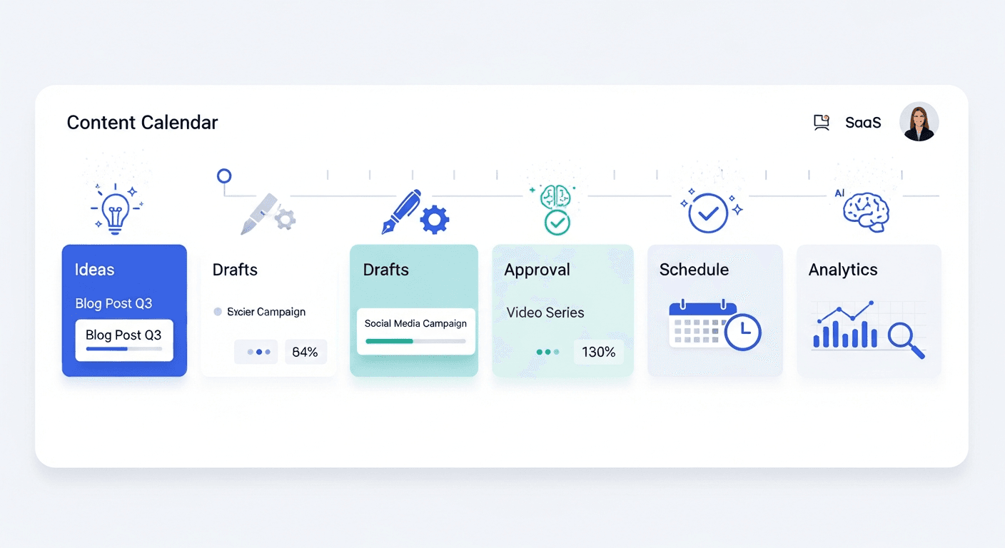
If you’re serious about creating engaging visual content and managing content effectively at scale, Hovers streamlines content creation workflows while you focus on the creative and strategic elements. The platform automates content calendars and helps you maintain consistent publishing cadence while exploring new formats like interactive content. Start creating engaging visual content today and explore how our platform can help you maintain momentum across all your interactive initiatives.
The future of content isn’t static. It’s interactive, personalized, and driven by genuine user participation. The tools exist. The capability is accessible. Now it’s time to experiment and see how interactive content transforms your engagement metrics and business results.
Article created using Hovers.ai